Back to Gallery
Components / Gallery
Photo Album
Free Gallery React component — PhotoAlbumCard. MIT licensed, copy-paste ready for Next.js and Tailwind CSS.
Swipeable square photo carousel with place and date caption plus dot indicators. Swap in your own photos and tell a travel story.
Preview


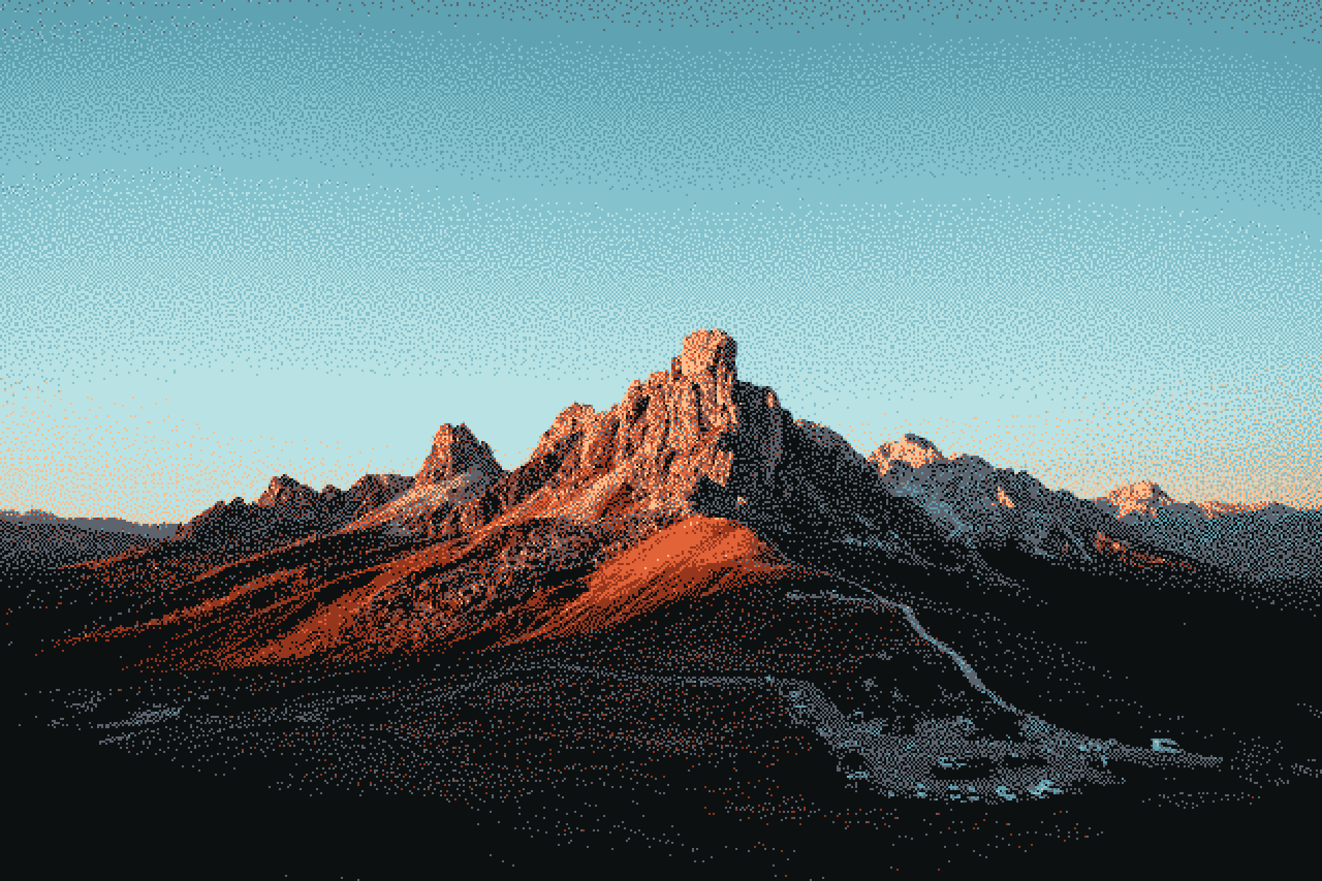

Kyoto
Mar 12
Setup
How to use
Free for personal and commercial use. No UI attribution required. Include the MIT copyright notice when copying component source into your project. Read the MIT license.
- 1
Run in your terminal:
$npm install clsx tailwind-merge lucide-react - 2
Copy
lib/cn.tsbelow. Skip if you already havecn(). - 3
Copy the code below and create
components/gallery/photo-album-card.tsxin your project. - 4
Import and render:
Exampleimport { PhotoAlbumCard } from "@/components/gallery/photo-album-card";
lib/cn.ts
import { type ClassValue, clsx } from "clsx";import { twMerge } from "tailwind-merge";export function cn(...inputs: ClassValue[]) {return twMerge(clsx(inputs));}
components/gallery/photo-album-card.tsx
"use client";import { forwardRef, useState, type ComponentPropsWithoutRef } from "react";import Image from "next/image";import { cn } from "@/lib/cn";export type AlbumPhoto = {id: string;place: string;date: string;src: string;};export type PhotoAlbumCardProps = Readonly<{photos?: AlbumPhoto[];onSlideChange?: (index: number, photo: AlbumPhoto) => void;} & ComponentPropsWithoutRef<"div">>;const defaultPhotos: AlbumPhoto[] = [{ id: "1", place: "Kyoto", date: "Mar 12", src: "/wallpaper-15.png" },{ id: "2", place: "Osaka", date: "Apr 03", src: "/wallpaper-3.png" },{ id: "3", place: "Hokkaido", date: "Jan 28", src: "/wallpaper-2.png" },{ id: "4", place: "Tokyo", date: "Jun 14", src: "/wallpaper-11.png" },];// Production-ready Photo Album component — styled with Tailwind CSS.export const PhotoAlbumCard = forwardRef<HTMLDivElement, PhotoAlbumCardProps>(({ className, photos = defaultPhotos, onSlideChange, ...props }, ref) => {const [index, setIndex] = useState(0);const total = photos.length;const select = (next: number) => {setIndex(next);onSlideChange?.(next, photos[next]);};const prev = () => select((index - 1 + total) % total);const next = () => select((index + 1) % total);const current = photos[index];return (<divref={ref}data-slot="photo-album-card"className={cn("w-80 overflow-hidden rounded-2xl border border-neutral-100 bg-white font-sans shadow-lg",className,)}{...props}><div className="relative aspect-square bg-neutral-100">{photos.map((photo, i) => (<Imagekey={photo.id}src={photo.src}alt={photo.place}fillpriority={i === 0}className={cn("object-cover transition-opacity duration-300 ease-out",i === index ? "opacity-100" : "opacity-0",)}sizes="320px"/>))}<buttontype="button"aria-label="Previous photo"onClick={prev}className="absolute inset-y-0 left-0 z-10 w-1/3 cursor-pointer"/><buttontype="button"aria-label="Next photo"onClick={next}className="absolute inset-y-0 right-0 z-10 w-1/3 cursor-pointer"/></div><div className="flex items-center justify-between gap-4 border-t border-neutral-100 px-4 py-3"><div className="min-w-0"><p className="truncate text-sm font-semibold text-neutral-900">{current.place}</p><p className="text-xs text-neutral-400">{current.date}</p></div><div className="flex shrink-0 items-center gap-1.5">{photos.map((photo, i) => (<buttonkey={photo.id}type="button"aria-label={`Show ${photo.place}`}aria-pressed={i === index}onClick={() => select(i)}className={cn("h-1.5 rounded-full transition-all duration-200",i === index ? "w-5 bg-neutral-900" : "w-1.5 bg-neutral-300",)}/>))}</div></div></div>);},);PhotoAlbumCard.displayName = "PhotoAlbumCard";